KryptonGroupBox ✓ LCode 已集成 Toolkit
命名空间:Krypton.Toolkit · 程序集:Krypton.Toolkit.dll
简介
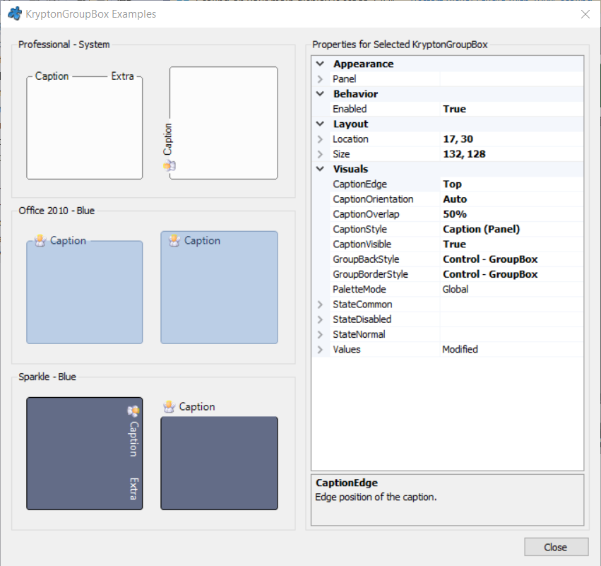
KryptonGroupBox 是增强型分组框控件,替代标准 System.Windows.Forms.GroupBox。它保留经典的「边框 + 左上角标题文字」样式,同时跟随 Krypton 主题渲染,标题文字与边框颜色可逐状态自定义,适合在设置面板、表单分区中对相关控件进行视觉分组。
常用属性
| 属性 | 类型 | 说明 |
|---|---|---|
Values.Heading | string | 分组框标题文字 |
Values.Description | string | 标题旁的补充描述文字 |
Values.Image | Image | 标题左侧图标 |
StateCommon.Border.Color1 | Color | 边框颜色 |
StateCommon.Border.Width | int | 边框宽度(-1 表示使用主题默认值) |
StateCommon.Border.Rounding | int | 边框圆角半径 |
StateCommon.Content.ShortText.Color1 | Color | 标题文字颜色 |
StateCommon.Content.ShortText.Font | Font | 标题文字字体 |
StateCommon.Back.Color1 | Color | 分组框内部背景色 |
Panel | KryptonGroup | 内部内容面板(子控件实际添加到 Panel 中) |
Controls | 集合 | 子控件集合(通过 Panel 承载) |
快速上手
基本用法
using Krypton.Toolkit;

// 创建分组框
var grpUser = new KryptonGroupBox();
grpUser.Values.Heading = "用户信息";
grpUser.Location = new Point(16, 16);
grpUser.Size = new Size(320, 160);

// 向分组框内添加控件
var lblName = new KryptonLabel();
lblName.Values.Text = "姓名:";
lblName.Location = new Point(12, 28);
grpUser.Controls.Add(lblName);

var txtName = new KryptonTextBox();
txtName.Location = new Point(70, 25);
grpUser.Controls.Add(txtName);

this.Controls.Add(grpUser);
带图标与描述的标题
grpUser.Values.Image = Properties.Resources.icon_user;
grpUser.Values.Description = "(必填)";
进阶用法
自定义标题与边框外观
// 加粗标题、主题绿色
grpUser.StateCommon.Content.ShortText.Font =
    new Font("微软雅黑", 9.5f, FontStyle.Bold);
grpUser.StateCommon.Content.ShortText.Color1 = Color.FromArgb(15, 118, 110);

// 圆角边框
grpUser.StateCommon.Border.Rounding = 6;
grpUser.StateCommon.Border.Color1 = Color.FromArgb(153, 246, 228);
grpUser.StateCommon.Border.Width = 1;
禁用整组控件
// Enabled 为 false 时,分组框及其内部所有子控件一起变灰
grpUser.Enabled = false;

// 恢复
grpUser.Enabled = true;
提示:与标准 GroupBox 不同,KryptonGroupBox 的子控件实际挂载在内部
Panel 属性指向的 KryptonGroup 面板上;直接对 Controls 添加即可,无需手动操作 Panel。
对应示例项目
📁 Source/Krypton Toolkit Examples/KryptonGroupBox Examples/
包含:标题图标/描述演示、边框圆角与配色自定义。